
 日本語
日本語 EN
EN 日本語
日本語The Woolie Witch logo

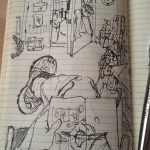
i used my moleskine book to design a logo for my wife’s new site www.thewooliewitch.com


Comments
You must be logged in to post a comment.
i used my moleskine book to design a logo for my wife’s new site www.thewooliewitch.com
You must be logged in to post a comment.
I think that the logo of the Woolie Witch is pretty cool. It has a lot of colors which is nice, and it’s not just an ordinary witch’s hat. It also has a face on it, which makes it look more like a person than just an ordinary hat. Try this https://masterbundles.com/best-shopify-themes/ site to download best themes. The colors are bright, but not too bright so that it looks garish or silly, and the design of the lettering makes it look serious and classy at the same time.
The Woolie Witch logo is a spellbinding masterpiece that effortlessly weaves together the mystique of wool and the enchantment of witchcraft. The intricate design captures the essence of both worlds, with a witch’s hat cleverly integrated into the woolen fibers, creating a seamless blend of magic and craftsmanship. For those seeking inspiration in logo design, the Woolie Witch logo serves as a prime example, offering a perfect balance of creativity and storytelling. These Writing hints, When crafting your logo, consider incorporating subtle elements that convey your brand’s narrative and captivate your audience’s imagination. The choice of colors adds a touch of warmth and vibrancy, making it visually appealing. The logo sparks curiosity and invites viewers to unravel its hidden symbolism.